How to Make Tiny Embroidery Letters Actually Readable?
Getting tiny text to look clean is honestly one of the hardest things to pull off, but using a proper embroidery digitizing setup changes everything. When letters are super small, even a tiny mistake with your needle will turn the whole thing into a blurry, messy blob that nobody can read. But if the file is built right, the stitches stay balanced and the words actually come out crisp. The trick is simply picking a font that doesn't crowd itself and adjusting the stitch gaps so every single letter has room to breathe.
 Stick to basic, clean fonts for small text because they actually hold up on fabric without warping. Proper file setup ensures there is enough breathing room between each character so the letters do not bleed into a giant clump. If the spacing is planned out right, the final design looks crisp on hats, hoodies, or totes. Beyond the digital file, your physical setup matters just as much. Pairing the right thread thickness with a sharp needle prevents the fabric from pulling and keeps your machine stitching smoothly without throwing a bunch of ugly knots.
 Using a tough backing stabilizer is a total lifesaver because it locks the fabric in place so everything stays aligned while the machine is running. If you skip this, the fabric shifts and the whole design looks distorted. Your machine speed matters a ton too. When dealing with delicate silks or super tiny lettering, dropping the machine speed down helps it stitch way cleaner without bunching. Lastly, always run a quick test design on a scrap piece of fabric first. It is the easiest way to dial in your tension and check for alignment issues before you accidentally ruin your actual shirt or jacket.
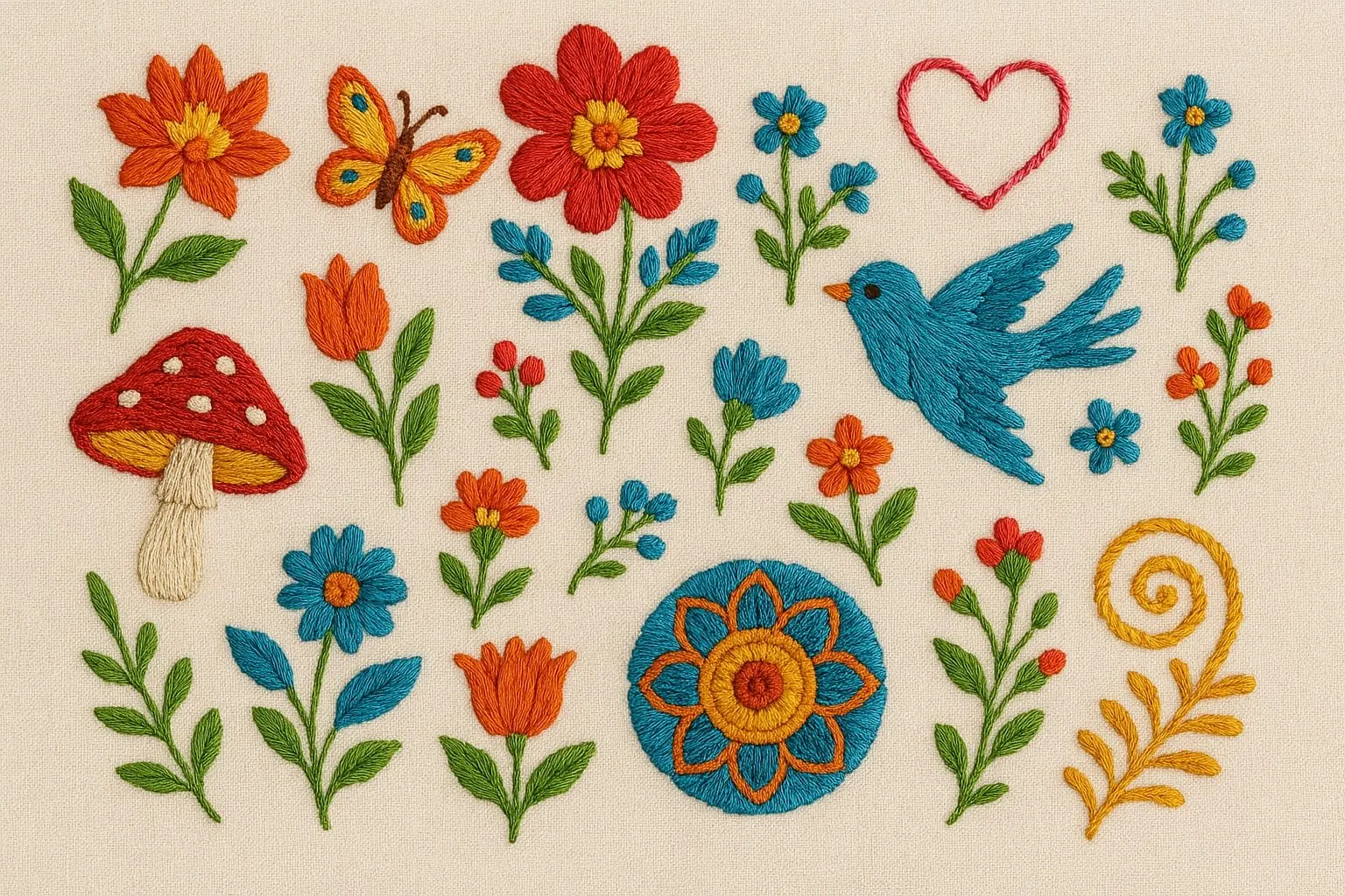 Taking your time to digitize small lettering embroidery carefully is what keeps it from looking like a messy clump of thread. Doing it right means the text actually stays readable, holds up after washing, and looks crisp. It is a huge deal for company branding because sloppy text makes your custom clothes look cheap, while clean stitches instantly make everything look more expensive. At the end of the day, handling tiny text comes down to proper file prep if you nail the setup, the final stitching takes care of itself.
 Crystal Digitizing is where you go when you need tiny text on clothes to actually be readable. We tweak everything from the font choice to the stitch angles so the letters don't bleed together into a messy blob. Our team handles the annoying backend stuff like stitch density, spacing, and the underlay so the design stays smooth on hoodies, caps, bags, or uniforms. We also dial in the right thread weight and needles to keep the fabric from puckering or pulling, even on super delicate materials. Every file is optimized to stay aligned and hold up in the wash, making your branding look expensive and sharp. We skip the automated shortcuts because we know that nailing the tiny details is what makes a logo stand out.


Comments
Post a Comment